March 13, 2026.
You see a currency pair making a big move. Everyone on social media is piling in, shouting "TO THE MOON!" or "CRASHING HARD!" It’s easy to get sucked into that noise, believe me. We all have. I did with EUR/USD back in '24 and paid for it. Big time. Overleveraged on what looked like an obvious breakout. Bad call.
What most traders miss, what gets lost in the frenzy of a single pair, is the context. What's the whole market doing? Is that big move on EUR/USD a Euro story, or a Dollar story? Is the JPY just getting clobbered across the board, or is it isolated? These are the questions you gotta ask, and honestly, clicking through a dozen charts to get that vibe check? It’s tedious. Nobody has time for that.
Beyond the Obvious: Why Context Matters More Than You Think
See, the common wisdom is you find a strong currency, you pair it with a weak one, and boom, trade setup. Simple, right? Not always. Sometimes, a "strong" currency is already exhausted, just waiting for a reversal. Or a "weak" one is merely correcting, poised to snap back. This is where most people get tripped up, including past me, more times than I care to admit.
The real advantage comes from instantly visualizing relative strength and weakness across all major currencies at once. This isn't just about identifying a leader; it's about spotting the laggards, the ones quietly consolidating, or the ones screaming for attention that nobody else is noticing yet. It’s the visual punch to the gut that tells you, "Hey, maybe that 'strong' currency you like isn't so strong after all."
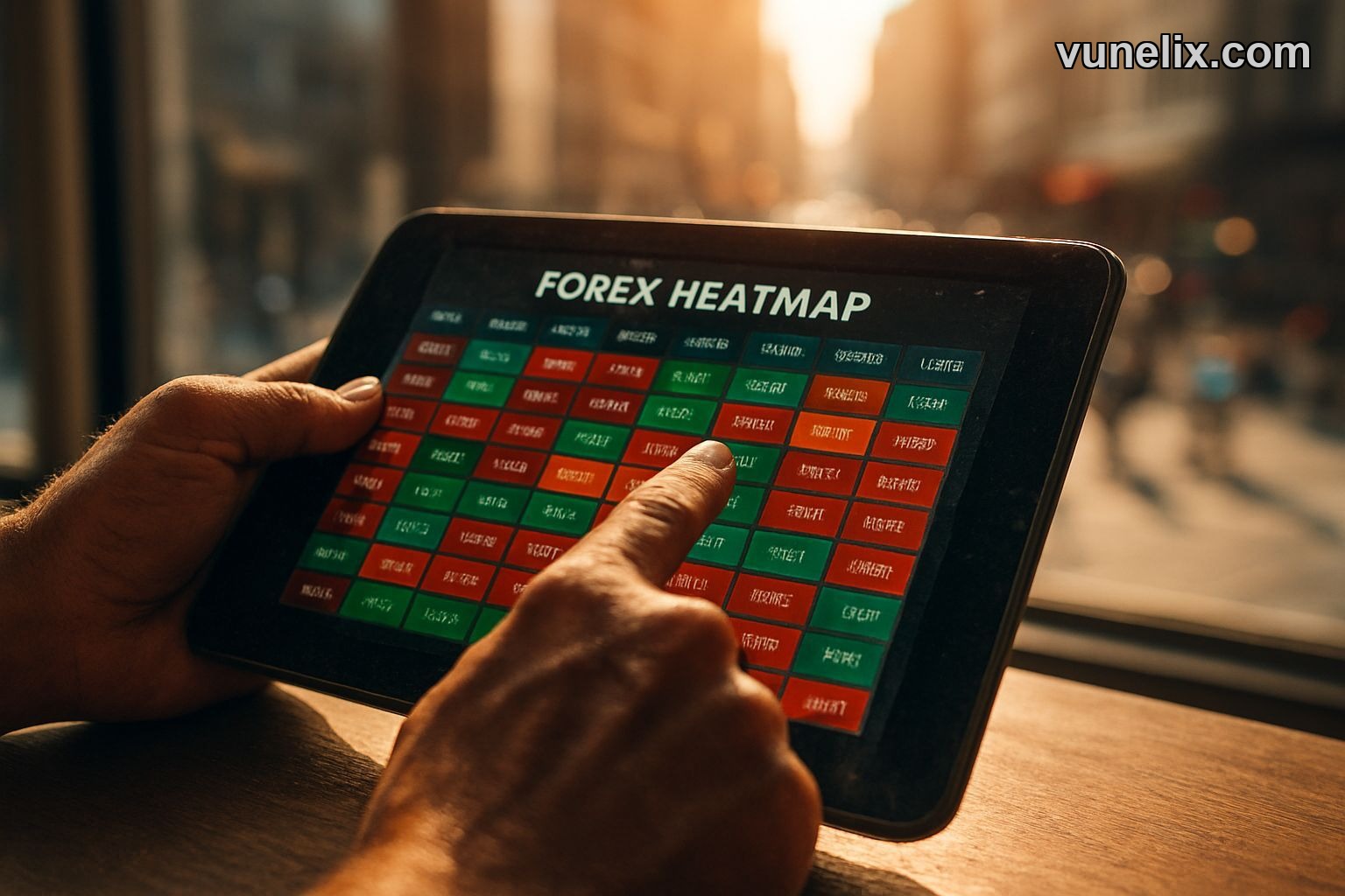
That's where the Forex Heatmap comes in handy. It cuts through the static. Instead of endlessly flipping through charts, trying to cross-reference multiple timeframes and currency crosses, you get an immediate read. Think of it as your instant visual indicator, showing you the biggest movers without needing a physics degree to interpret it. The clarity it brings can be shocking, honestly, especially if you’re used to more complicated tools.
Forex Heatmap: Features and Your Edge
This thing is dead simple, which is its biggest strength. No bloat, no signups, no hidden fees. It just works, right here on Vunelix. It takes the major currencies, compares them against each other, and shows you, in plain sight, who's winning and who's losing over various timeframes. I typically use the 1H and 4H views myself. Gives you a good immediate picture without getting lost in the noise of a 5-minute chart.
- Live Data Feed: Updates automatically, no refreshing needed.
- Multiple Timeframes: Choose from 5M, 15M, 30M, 1H, 2H, 4H, Daily. Pick your poison.
- Visual Strength & Weakness: Colors indicate strength (green) and weakness (red), with shades for intensity. No guessing.
- All Major Currencies: Covers AUD, CAD, CHF, EUR, GBP, JPY, NZD, USD. The usual suspects.
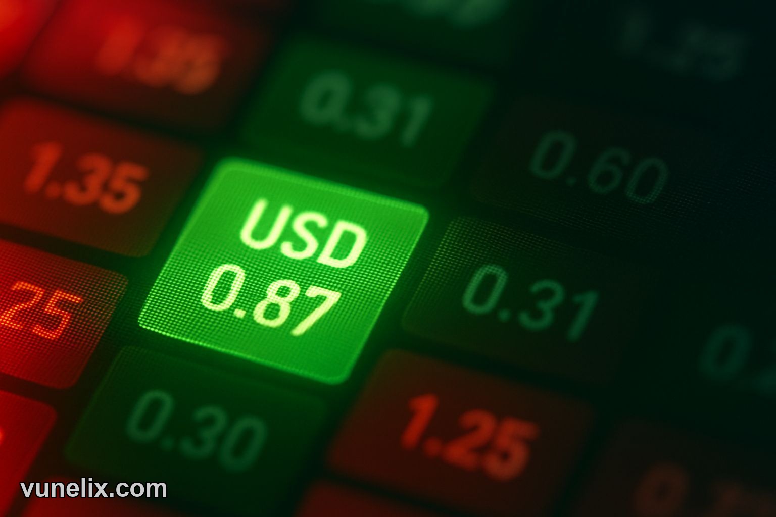
- Percentage Change: Hover over any cell to see the exact percentage change for that pair in that timeframe.
The beauty of this screener is how quickly you can pivot. Saw EUR looking strong, but the widget shows GBP is actually stronger across several timeframes? Maybe GBP/USD is the better play than EUR/USD. It changes your perspective on the fly. I’ve seen days where a currency looked weak on its own, but the heatmap showed it was only weak against ONE specific other currency, while strong against everything else. Massive distinction.
It's not just a standalone tool either. Pair it with something like the currency cross rates widget to drill down into specific pairs once you’ve identified a strong/weak combo. Suddenly, your analysis workflow is streamlined. This isn’t about blindly following a signal; it’s about getting a crucial piece of the puzzle fast.
Real Trading, Real Scenarios (and an Embed)
Let me throw a real scenario at you. Say you're eyeballing an entry on USD/JPY. Most people look at the USD strength indicators or JPY weakness. But what if the heatmap tells you JPY is actually strong against almost everything except USD? That shifts your perspective immediately. It might mean the USD strength is real, or it might mean JPY is just having a temporary dip against the dollar. The heatmap shows you the relative pressure points.
I missed a monster move on AUD/JPY last year because I was so focused on trying to short the Yen. The heatmap, if I'd been paying attention to it, would have screamed "AUD STRENGTH" in bold green, consistently. I was looking at individual indicators, not the whole damn picture. Ended up taking a small loss on another pair because I ignored the obvious current. Rookie mistake, even after all these years. This widget prevents that tunnel vision.
And here’s another thing: this isn’t just for individual traders. You got a blog? A financial website? Slap this bad boy on your page. The free Forex Heatmap embed feature is no joke. It's totally free, no strings, no account needed. Imagine offering your readers live, real-time market insights without having to build it yourself. That's a serious value add for absolutely nothing. You can get more free tools here too.
My Honest Take on This Free Powerhouse
Look, I'm not gonna tell you this heatmap is some magical crystal ball. It’s not. But it is an incredibly powerful, unbelievably simple, and best of all, free tool that gives you an instant bird's-eye view of the forex market. It tells you which currencies are flexing and which ones are feeling the pain, across multiple timeframes, without you having to lift a finger past hitting the refresh button on the page (though it updates live anyway).
It’s about being smarter, faster, and having more context than the guy next to you. In my book, this free Forex Heatmap for 2026 is one of the clearest, most practical tools out there. It helped me see my past mistakes for what they were: a lack of global perspective.
If you're serious about your trading, or even just curious about currency movements, you owe it to yourself to spend some time with this thing. It won't trade for you, but it sure as hell will help you make better decisions. No fluff, just facts, live and direct.