I checked sector rotation yesterday morning. Tech was bleeding red while energy popped green. Five minutes, one glance, no scrolling through fifty ticker symbols. That's what heatmaps do — compress the entire market into a color grid.
This widget shows stock performance by sector and individual names. Free, no account, embeds anywhere. You paste a snippet and it runs.
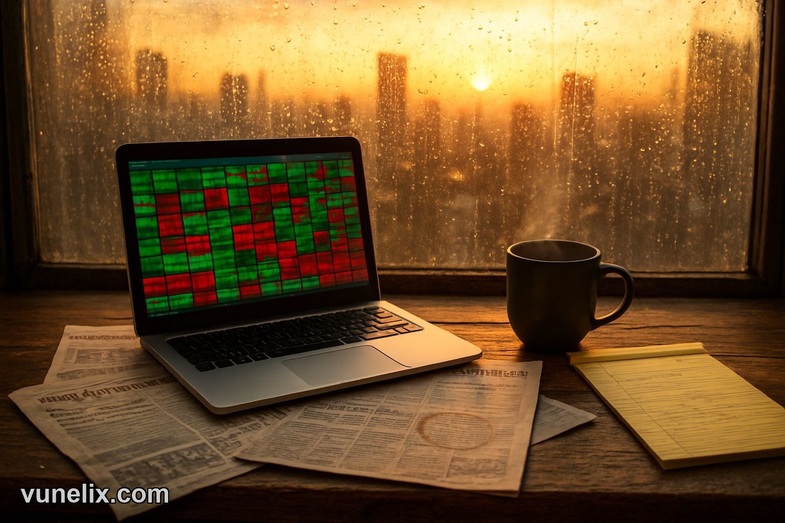
What It Shows
Color blocks sized by market cap. Bigger squares = bigger companies. Green = up, red = down. Hover over a block and you get the ticker, price change, percentage move.
Sectors group together — financials in one zone, healthcare in another. If you see a whole corner turning red, that's sector weakness. If one square inside a green sector is red, that's individual stock trouble, not the sector. Different story, different trade setup.
The widget pulls live data. Not delayed fifteen minutes like some free tools. It updates during market hours. I've used it next to my charts and the prices match.
Setup Takes Two Minutes
You go to the widget page, pick your settings — sectors to include, color scheme, size. Copy the embed code. Drop it into your HTML. Done.
No API key. No signup wall. No credit card "just in case". It's actually free, which is rare now.

I embedded it on a basic WordPress site. Worked on first try. Same with Webflow and a custom-built page. The code is clean, doesn't break layouts or slow load times. I checked speed with and without the widget — no difference I could measure.
When I Use It
Morning routine: market open, check the heatmap. If I see tech heavy red and energy heavy green, I know it's a rotation day. That changes which stocks I watch. Sector-specific plays matter more than broad index moves on those days.
During midday chop I glance at it to see if anything shifted. Sometimes a sector flips color in an hour. That's either a news event or a false move, but either way it's worth noticing before I add to a position.
I also use it to spot laggards in strong sectors. If consumer staples are up 1.5% but one name in that group is flat, there's a reason. Earnings miss, downgrade, something. Might be a short setup or just a stock to avoid.
| Feature | Detail |
|---|---|
| Update Speed | Live during market hours |
| Sectors Covered | All eleven S&P sectors |
| Customization | Color themes, size, sector filters |
| Embed Code | Single script tag, no dependencies |
| Mobile Display | Responsive, scales down cleanly |
It's Not a Screener
Don't expect filters or sorting. This isn't a stock market movers widget where you rank by percentage change or volume. It's a snapshot tool. You look, you notice patterns, you move on.
If you want a list of top gainers, check the movers widget instead. If you want a scrolling tape of prices, use the ticker tape widget. Heatmaps do one thing well — show relative performance across a lot of names at once.
Embed on Client Sites
I built a page for someone who runs a stock newsletter. They wanted readers to see sector performance without leaving the site. I dropped this in, styled the container to match their theme. Took ten minutes including the CSS tweaks.
The widget doesn't have branding unless you add it. No "powered by" logo stuck in the corner. Clean embed, your site, your design. If you're building financial content sites or dashboards, that matters.
Color Schemes Actually Work
Default is green/red. Fine. But if you're red-green colorblind or just prefer a different look, there are blue/orange and yellow/purple options. I switched to blue/orange once for a site with a dark theme. Looked better, still easy to read.
Some heatmap tools give you one color option and that's it. This one gives you three. Small thing, but if you're picky about design it's nice to have.
Mobile Works
I checked it on my phone. Blocks resize, still readable. You can tap a square and see the details. Not as smooth as desktop but usable. Some embed widgets turn into a blurry mess on mobile. This one doesn't.
No Upsell
You get the whole thing. No "unlock premium features" or "upgrade for real-time". It's all live, all included. I kept waiting for the catch and there isn't one. That's unusual enough to mention.
If you want more tools, Vunelix has other free financial widgets — crypto heatmaps, currency converters, market movers. Same deal, no signup, no cost. Use one, use all, doesn't matter.
By 2027 heatmaps will be standard on every trading blog because scrolling through tickers feels as outdated as checking stock prices in the newspaper.