I got tired of tabbing through 15 different coin pages just to figure out what was moving. You check Bitcoin, then ETH, then scroll through a watchlist, refresh CoinGecko three times — by the time you're done the move already happened. That's why I started using Vunelix's crypto heatmap back when I realized traditional lists weren't cutting it anymore.
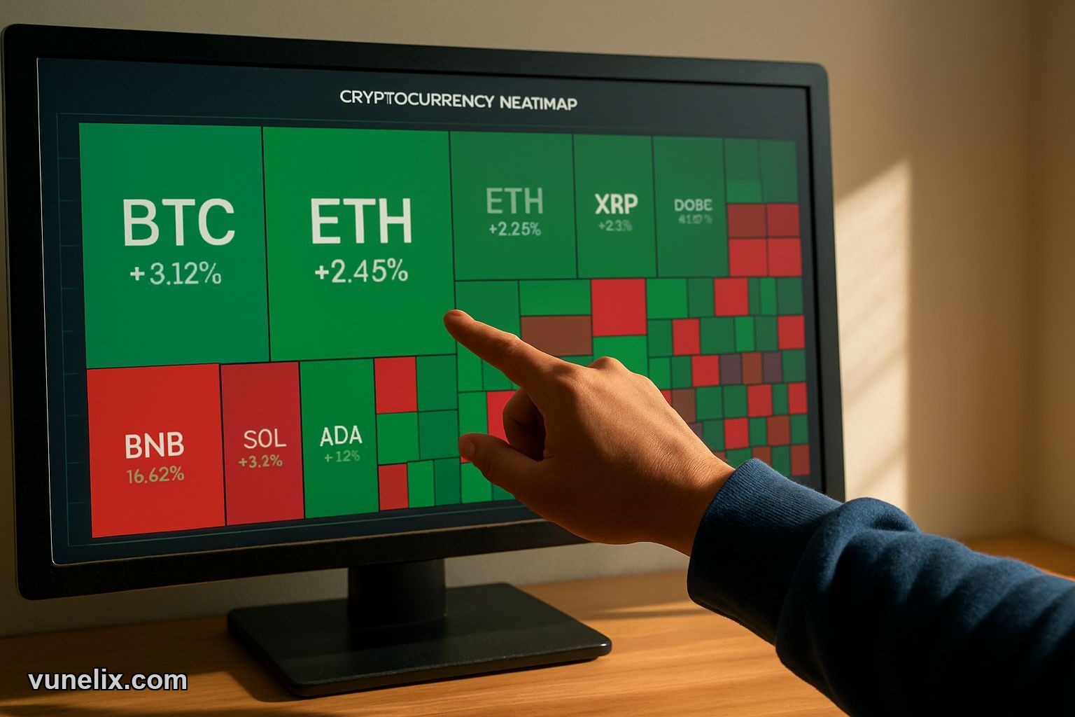
What the Heatmap Actually Shows
It's a treemap. Each coin gets a block sized by market cap. Bitcoin takes up the most space because it has the biggest market cap. Some random DeFi token with $2M market cap gets a tiny square you can barely see. Simple math — big coin, big block.
Color tells you performance. Green means up, red means down. Light green is boring 2% move. Bright green is 8% pump you probably want to look at. Deep red is bloodbath territory. The intensity matters more than the color itself — I've learned to ignore anything lighter than medium shade because it's just noise.
You get 11 timeframes. 30 minutes for scalpers who live dangerously. 1 hour, 4 hour for day traders. 24 hour for normal people. Then weekly, monthly, quarterly views. I flip between 24h and 7d most often. The 1-year view is depressing after 2022 but useful when you need perspective.
Sector Filtering Changed How I Trade
This is where Vunelix gets good. You can filter by DeFi, Layer 1, Layer 2, Gaming, AI, Meme coins. When GameFi tokens all turn green at once while everything else is red, that's a sector rotation you need to know about. I caught a small Layer 2 pump in December because I saw the whole sector light up bright green on the 4h chart.
The "exclude Bitcoin" filter matters more than it sounds. Sometimes BTC is flat but alts are going wild. If you leave Bitcoin in the view it dominates the entire visual and you miss what's actually moving. Same with stablecoins — nobody needs to see USDT and USDC taking up space with their 0.01% moves.
I use the DeFi filter when yields start spiking. Gaming filter during big game releases or token unlocks. Meme filter when I feel like punishing myself by watching pump-and-dump chaos in real time.
Pattern Recognition Beats Scrolling Lists
Your brain processes visual patterns faster than text. When you see a cluster of mid-cap coins in one sector all turn the same shade of green, you notice it instantly. On a traditional list you'd need to manually scan through 50 rows and do mental comparisons. That's slow.
I've spotted rotations this way that I would've completely missed on CoinMarketCap. Like when privacy coins all pumped together for three days in January — seeing them cluster visually made it obvious something was happening. Or when every AI-related token dumped simultaneously after that one bad news cycle. Pattern recognition is automatic with a heatmap.
The hover details are cleaner than I expected. You mouse over a block, get current price, 24h volume, market cap rank, circulating supply, and multi-period changes. It's enough data to decide if you want to open the full chart without leaving the heatmap view.
When It Actually Helps
Market-wide events. When everything dumps together you see it immediately — the whole screen goes red and you know it's macro, not coin-specific. When only one sector crashes while others stay green, different story. That's isolated weakness worth investigating.
Altcoin season detection. If mid-caps and small-caps are all bright green while BTC is flat or slightly red, that's your signal. You don't need someone on Twitter to tell you "alt season starting" when the heatmap already shows 80% of the blocks in green.
Pre-market routine. I check the heatmap before making any trades now. Takes 15 seconds to see if it's a risk-on day, risk-off day, or sector-specific move. That context prevents stupid trades — like buying a small-cap during a market-wide dump just because "it's down a lot."
What It Doesn't Do
No alerts. You can't set a notification for when DeFi sector goes up 10%. You have to manually check. I'd pay extra for that feature but it doesn't exist yet.
Limited to 500-ish coins. If you're trading micro-caps with $200K market cap on obscure DEXs, they won't show up here. This covers everything that matters liquidity-wise but not the degen stuff.
No historical playback. Can't go back and see what the heatmap looked like on a specific date last month. Would be useful for backtesting theories about sector rotations but the tool only shows current data across different timeframes.
Other Vunelix Tools Worth Knowing
The platform isn't just the heatmap. There's a crypto screener for finding coins by specific criteria — volume spikes, new highs, technical patterns. I use that when the heatmap shows me an interesting sector and I want to dig into individual coins.
They have a charting tool that's cleaner than TradingView for quick analysis. And a stock heatmap that works the same way for equities, which I check when crypto is boring and I need to see what tech stocks are doing.
Free to use. No signup wall, no paywall after 3 views, no "upgrade to see real-time data" nonsense. I don't know how long that lasts but right now it's just open and use.
Who Should Use This
Day traders who need fast market overview without clicking through 50 tabs. Swing traders looking for sector rotations. Anyone managing a portfolio of more than 10 coins who's tired of manually checking each one. It's not for people who only hold Bitcoin and don't care about anything else — you don't need a heatmap for one asset.
I still use other tools. Order books for entries, TradingView for detailed TA, on-chain metrics for bigger decisions. But for "what's moving right now across the entire market," nothing beats the Vunelix heatmap. Saved me time, caught me opportunities I would've missed, stopped me from buying into sector-wide dumps. That's worth more than the $0 it costs.