I've used price tables for years. Scrolling through rows of numbers, trying to figure out which coins are actually moving. It's terrible. Your brain can't process 500 rows of data looking for patterns.
Then I found the Vunelix crypto heatmap. It's just blocks. Big blocks, small blocks, green, red. But it works.
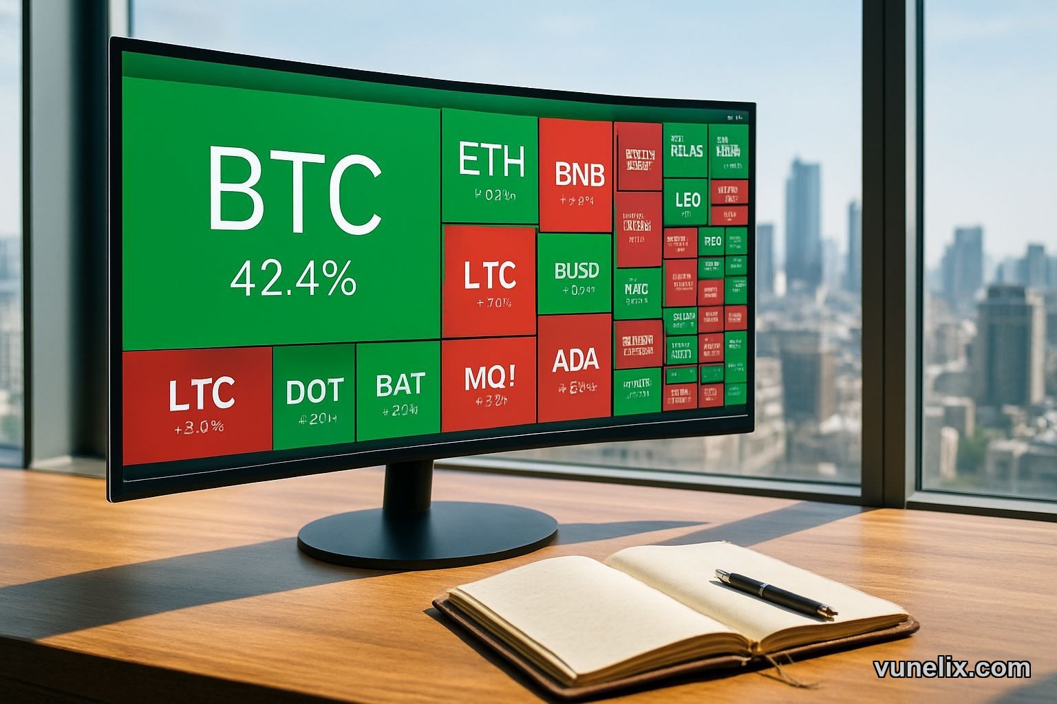
What the Heatmap Actually Shows
Each block is a cryptocurrency. Size equals market cap — Bitcoin gets a massive block, some obscure token gets a tiny square. Color tells you price movement. Green is up, red is down. Darker green means bigger gains, darker red means bigger losses.
You can switch timeframes. One hour if you're day trading, seven days if you're checking weekly trends, all-time if you want to see which coins are actually long-term winners. The visualization updates in real-time, so when Bitcoin suddenly jumps 3%, that big block shifts from light green to darker green immediately.
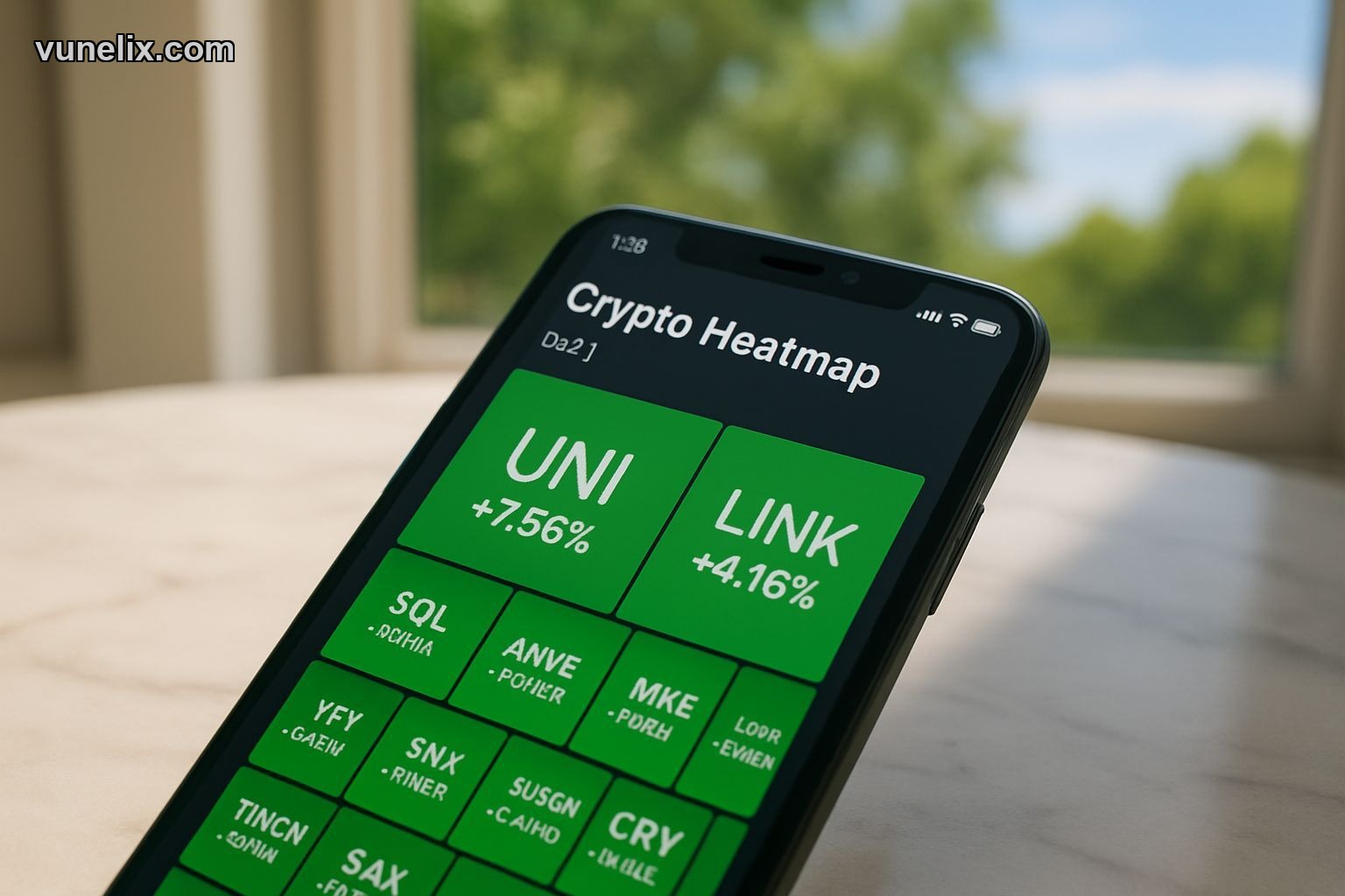
Hover over any block and you get the details — current price, 24-hour volume, market cap ranking, circulating supply, percentage changes across multiple periods. But the point isn't to hover over everything. The point is pattern recognition.
Why Block Size Matters More Than You Think
Market cap sizing is the key feature most people miss. When you look at a traditional watchlist, a 10% gain on a $50 million coin looks identical to a 10% gain on Bitcoin. But they're not the same story.
On the heatmap, that small-cap pump shows up as a tiny bright green square while Bitcoin's move is a huge block. Your eye immediately understands the difference — one is a small speculation play, the other is billions of dollars moving. This matters when you're trying to gauge whether a rally is real or just noise in low-liquidity tokens.
I've caught sector rotations this way. Last year I watched all the DeFi blocks turn green while everything else stayed red. Didn't need to check Twitter or read analysis — the heatmap just showed money flowing into one specific category. That's when I added more DeFi exposure. Not a genius call, just reading what the visualization was screaming at me.
The Sector Filter Nobody Uses
Vunelix lets you group by categories — DeFi, Layer 1, Layer 2, Gaming, AI, Meme coins, stablecoins. Most traders ignore this. Mistake.
When you filter to just DeFi tokens, you see the entire sector at once. Are they all green together? That's sector strength. Are half green, half red? That's stock-picking territory. Are they all deep red while Bitcoin is green? That's sector weakness and maybe you wait.
Same with meme coins. I don't trade them often, but when I check the meme filter and see everything bright green, I know retail is active and risk appetite is high. When memes are all red and Bitcoin is climbing, that's a different kind of market — institutions buying, retail sitting out.
The Gaming category filter helped me dodge a bad trade last September. I was looking at one gaming token, chart looked decent. Then I filtered the heatmap to just Gaming — every single block was red. The whole sector was bleeding. I passed. Two weeks later, that token was down another 30%. The heatmap gave me context my individual chart didn't.
Time Frames Change Everything
The one-hour view is chaos. Blocks flipping colors constantly, small pumps and dumps everywhere. I use it during high volatility days — when Bitcoin drops 5% in an hour, I want to see if altcoins are following or holding up.
Four-hour view smooths out the noise. Better for intraday decisions. 24-hour is what I default to — enough data to be meaningful, short enough to catch momentum shifts.
Seven-day view shows you the real trends. When I see a mid-cap coin deep green over seven days while most of the market is red or flat, that's a signal worth investigating. Something's happening with that project — new partnership, product launch, I don't know yet, but the price is telling me to look.
I rarely use the all-time view. It's depressing. Most coins are deep red from their all-time highs. But it's useful for perspective when everything feels like it's pumping — zoom out and remember 90% of tokens never recovered from 2021.
What It Doesn't Do
The heatmap won't tell you why a coin is moving. It won't explain fundamentals or give you entry and exit signals. It's not a trading system. It's a visualization tool for opportunity spotting and market reading.
You still need to do the work — check the crypto screener for detailed metrics, look at the charts, read the news. But the heatmap gets you there faster. It shows you where to look.
I've also found it's terrible for timing entries. Just because a block turns green doesn't mean it's a good buy — could be the top of a pump. And red blocks can keep getting redder. The heatmap shows you what's happening, not what to do about it.
How I Actually Use It
First thing in the morning, I open the 24-hour heatmap. Takes five seconds to see if it's a risk-on day (altcoins green), risk-off (Bitcoin dominance high), or just sideways chop (everything mixed).
If I see a sector all green, I filter to that category and scan for individual standouts. If one token is significantly greener than its peers, I investigate why. Sometimes it's news I missed. Sometimes it's just a low-liquidity pump. But I wouldn't have seen it scrolling a price list.
During market crashes, I watch the heatmap for capitulation signs. When even the usually-stable large-caps turn deep red together, that's peak fear. Not saying it's the bottom — I've been wrong — but it's a signal that selling is indiscriminate and emotional.
I also check it before making any major trade. If I'm about to buy a DeFi token and I check the heatmap and see the entire DeFi sector is red, I ask myself why I'm fighting the sector trend. Sometimes I still do the trade, but at least I'm aware I'm swimming against the current.
The Speed Advantage
You can scan 500 cryptocurrencies in about ten seconds with the heatmap. Try doing that with a price table. You can't. Your eyes glaze over by row 30.
Pattern recognition is faster than data processing. Your brain immediately sees "big green block surrounded by red" and knows that's interesting. You don't need to read numbers, compare percentages, calculate market cap rankings. It's just there.
This matters more as the crypto market adds more tokens. There are thousands of coins now. You can't track them all individually. But you can scan a heatmap and let the visualization highlight the outliers worth your attention.
I've found coins I'd never heard of this way. Small blocks that turned bright green over seven days, buried in a corner of the heatmap between bigger names. Some were garbage. But a few became solid trades because I spotted them early through pure visual scanning.
Why Most Traders Still Use Tables
Habit mostly. People are used to rows and columns. Numbers feel more precise, more serious, more professional than colored blocks.
But precision isn't the same as insight. You can stare at precise numbers and miss the big picture. The heatmap sacrifices some numerical detail for pattern clarity. That's the trade-off, and for market scanning, I think it's worth it.
Some traders also don't trust visualizations. They want to see the actual percentage, the exact price. Fair. But Vunelix shows you the exact numbers when you hover. You get both — quick visual scan plus detailed data on demand.
The heatmap also doesn't give you that feeling of "doing work" that scrolling through tables does. It feels too easy. But easy is good when you're trying to monitor hundreds of assets and make fast decisions.
By 2027, every trader will have a heatmap open — the ones still using tables will wonder why they're always late to sector rotations.